Share

The team is an amateur hockey club from Ontario, Canada, bringing together passionate players and fans around the love of the game. The project included the creation of a unique name, logo, corporate identity, and a full brand book, designed to strengthen the team’s image and build recognition both on and off the ice.
Client
Amateur Hockey Team, Ontario
Industry
Sports & Entertainment
Published
©2024


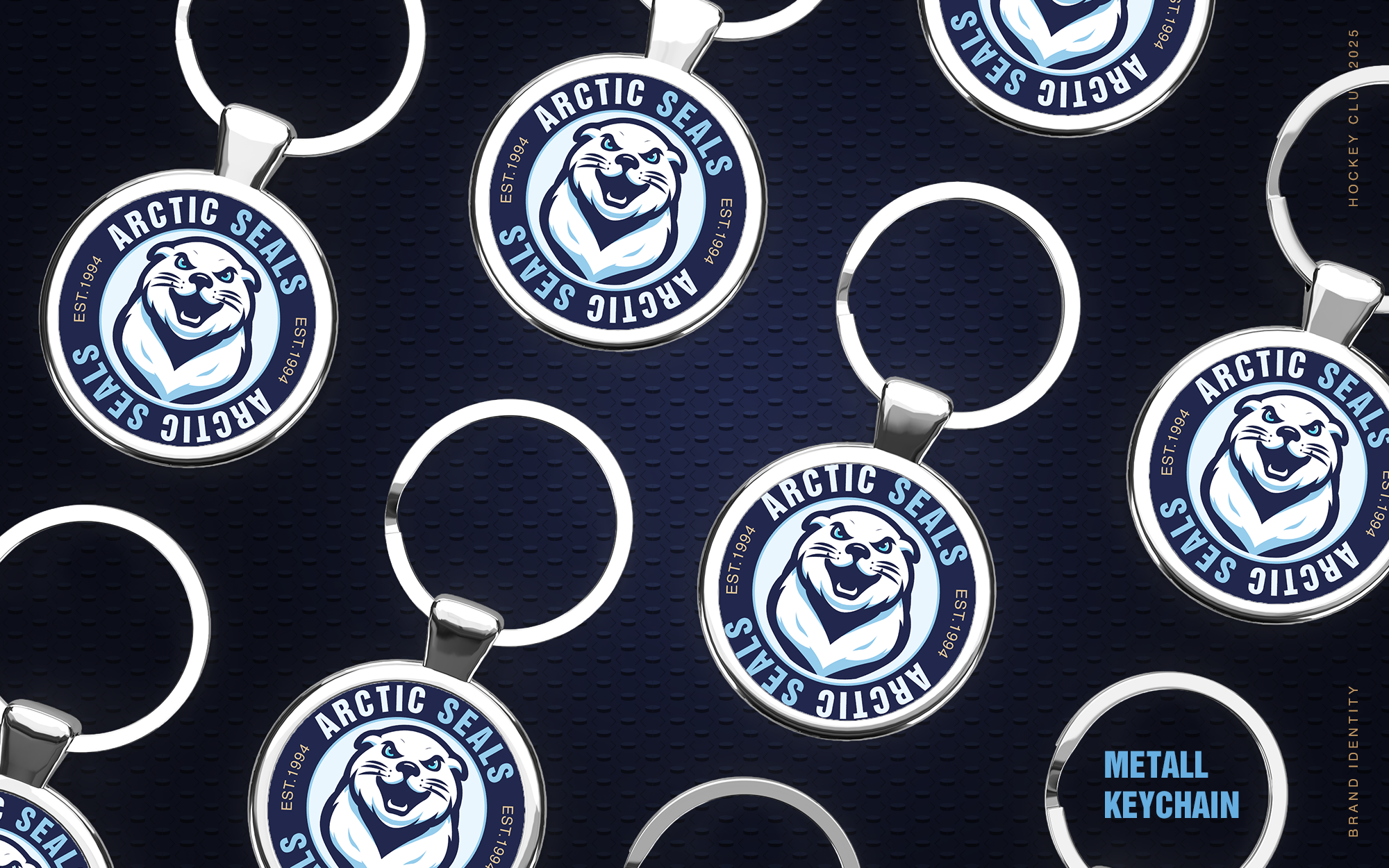

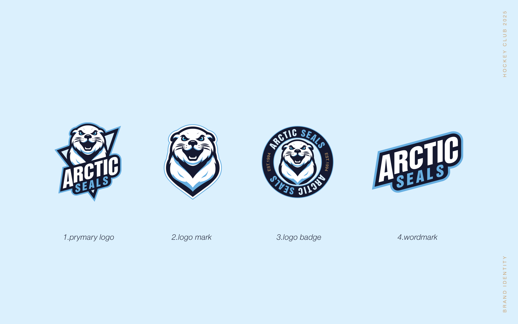
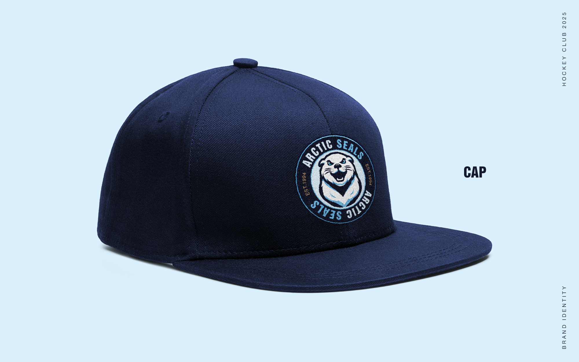
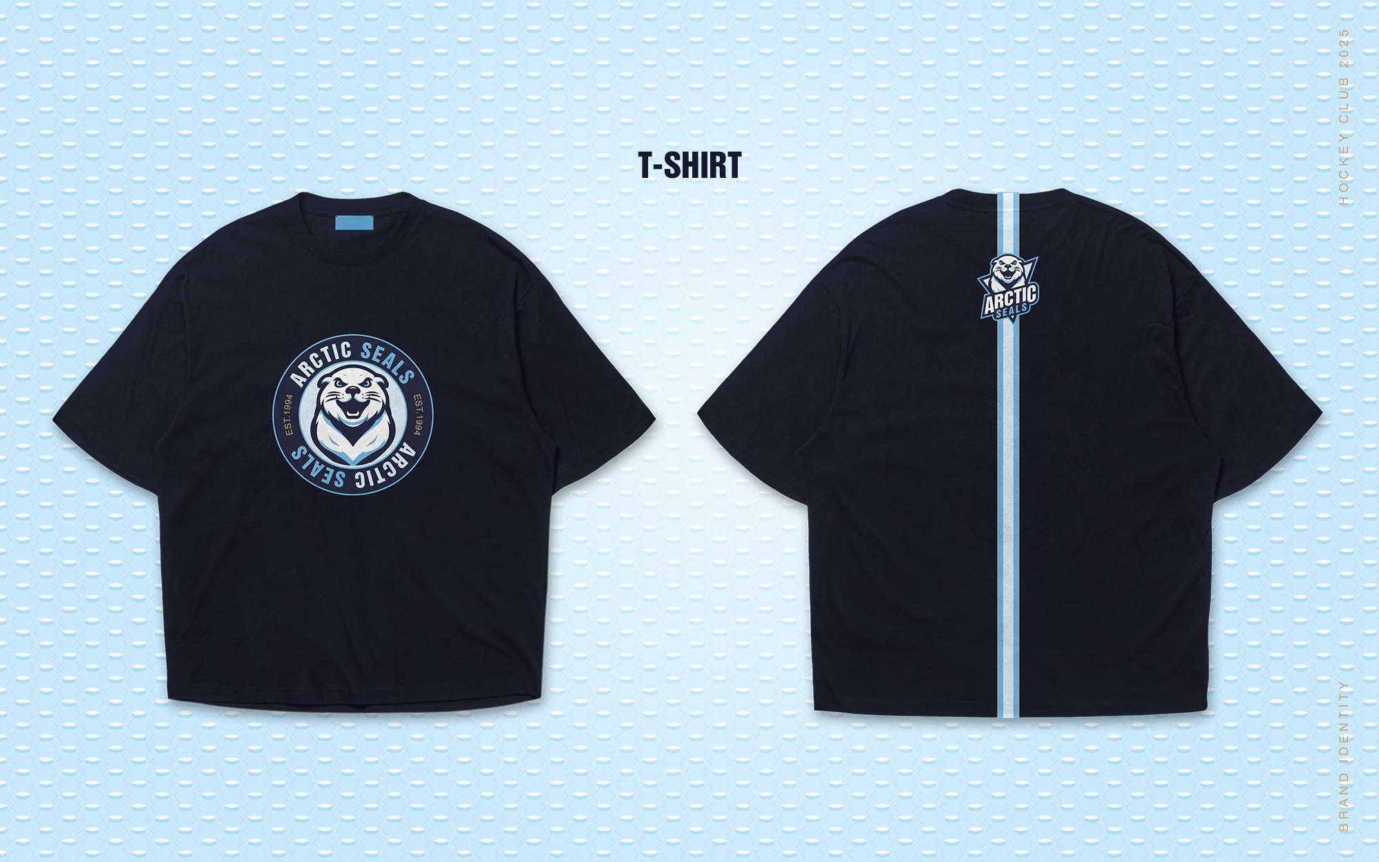
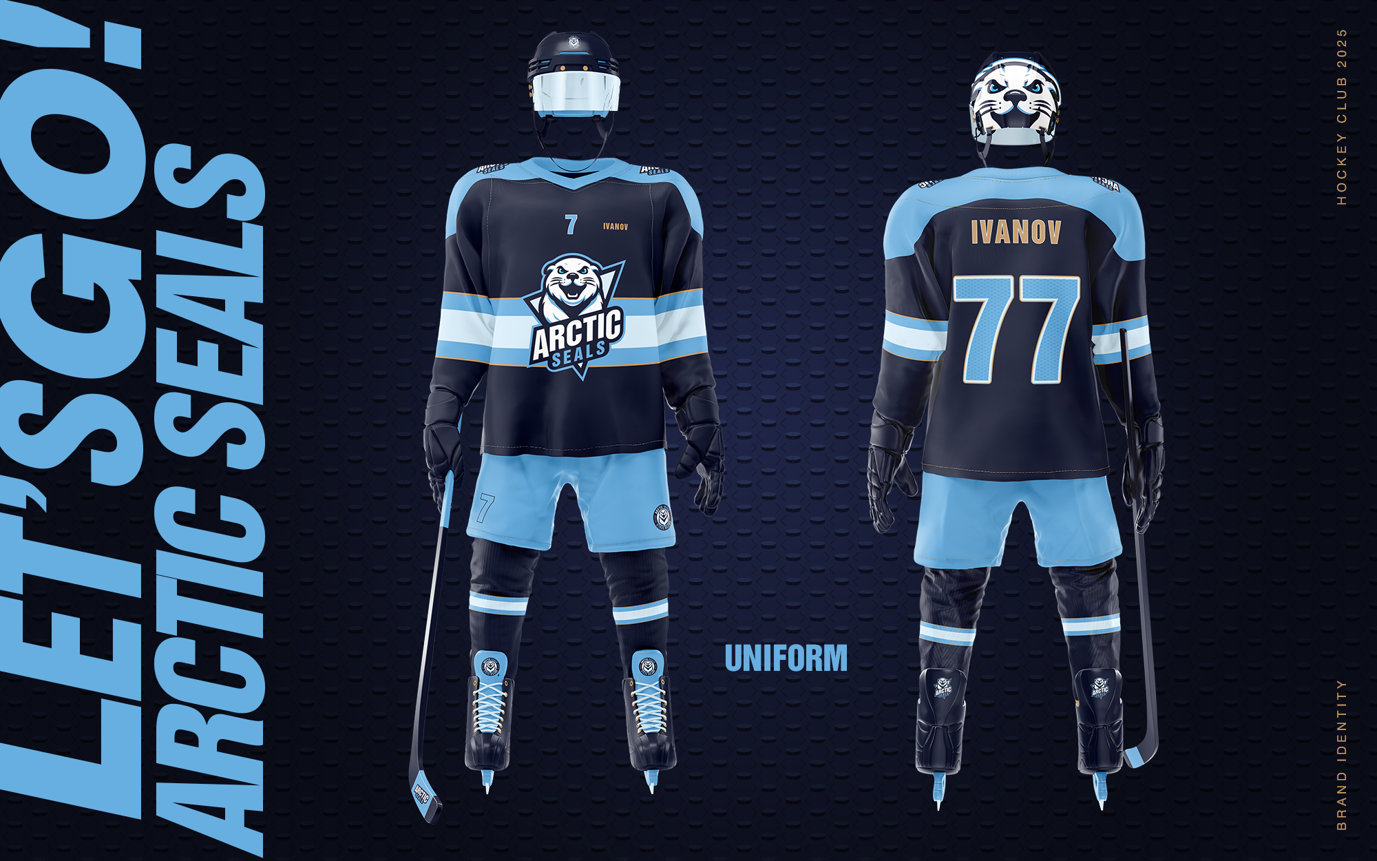
Brand Identity A bold and energetic identity rooted in strength and playfulness
The brand identity was built around the metaphor of ice, using deep blue tones to convey strength and
resilience. The logo features a custom sea lion mascot that balances playfulness with a competitive edge,
creating both a friendly and dynamic image.
The design draws on North American sports aesthetics, emphasizing speed and energy. The identity
extends across jerseys, merchandise, and digital platforms, ensuring a consistent and engaging presence
for the team.
Impact
This brand identity positions ArcticSeals as a dynamic and memorable sports team, combining the
energy of hockey with a bold and fan-friendly visual style. The use of deep ice-blue tones and the
distinctive sea lion mascot enhances recognition, builds emotional connection with supporters, and
strengthens the team’s presence both on the ice and within the community.


Take a look at our work Featured case studies
Real estate, tech, fashion, cosmetics — we’ve helped clients across industries create sharp, memorable and legally safe brands
View full portfolio
BLUE WAVE
Case Study KILEV LAB — Logo, Brand Identity & Brand Book for a Premium Apartment Complex in Senegal
View Project
Balance
Kilev Lab Case Study: Logo, Packaging & Brand Identity for Professional Fertilizers
View Project
Papaya
Logo redesign and brand identity for a premium Pan-Asian restaurant. A case study by KILEV LAB.
View Project