


6 min read
Updated on 03 Aug 2026
A transparent look at the creative process behind the Shohin Airlines identity — from nine original logo concepts to a client-supplied AI-assisted mark and a complete aviation brand system.
Shohin Airlines, a private airline registered in Tajikistan, approached KILEV LAB to develop its branding and visual identity. The name “Shohin” means “falcon” in Tajik, giving the project a strong cultural and symbolic foundation from the beginning.
The First Round: Three Distinct Directions
The agreed creative scope began with three logo concepts developed according to the client’s technical brief. Rather than presenting superficial variations of one idea, our team built three distinct strategic directions, each exploring a different balance of the falcon symbol, flight, Tajik national character and the visual language of a modern airline.
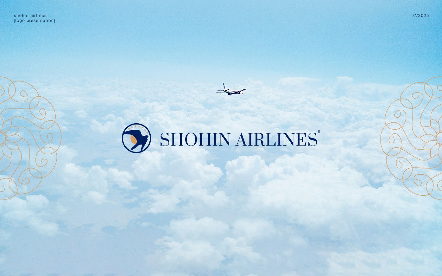
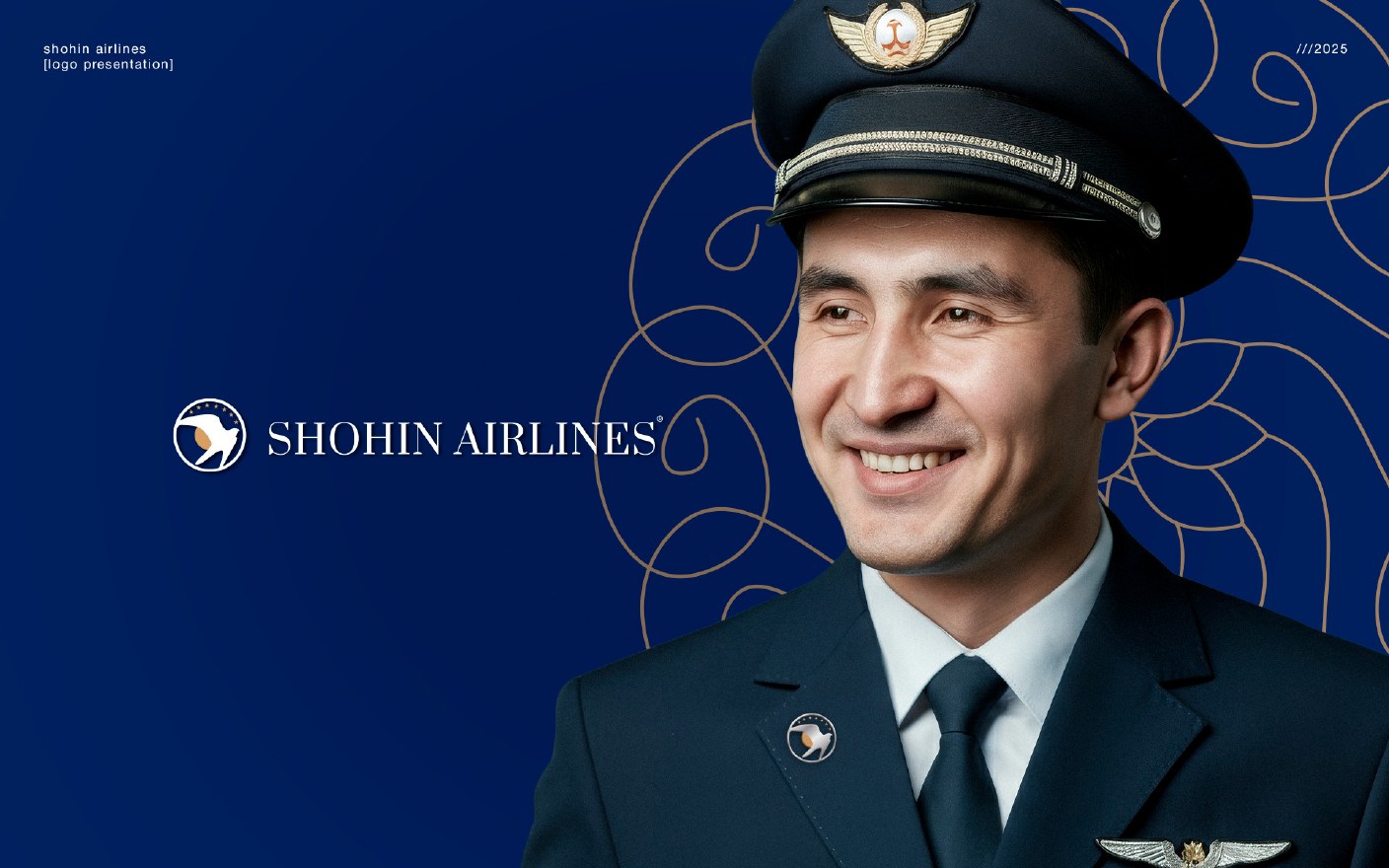
Concept 1 — A Premium Blue-and-Gold Identity
The first direction was the most restrained and premium. A graphic falcon emblem, deep aviation blue and warm gold created a confident, internationally recognisable identity with the composure expected from a private airline.
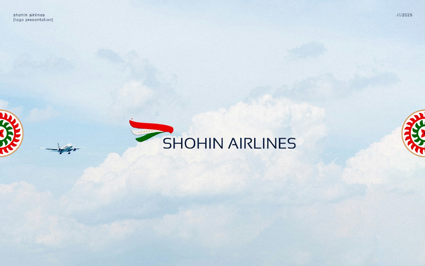
Concept 2 — A Dynamic National Symbol
The second direction translated the colours of Tajikistan into a compact, fast-moving mark. The red, white and green forms suggest both a wing and a flag in motion, giving the airline a contemporary national signature that remains clear at small sizes.
Concept 3 — A More Traditional Expression
The third direction retained the energy of the national palette while introducing a more traditional and ornamental character. Its layered forms connect the idea of a falcon in flight with local visual heritage, producing a distinctive regional expression.
The client did not approve the first-round directions and requested another round. We developed three additional concepts. When those were also not selected, we produced a third round of three. In total, KILEV LAB created nine original logo concepts for Shohin Airlines. The three concepts shown above document the complete first presentation.
How We Saw Shohin Airlines
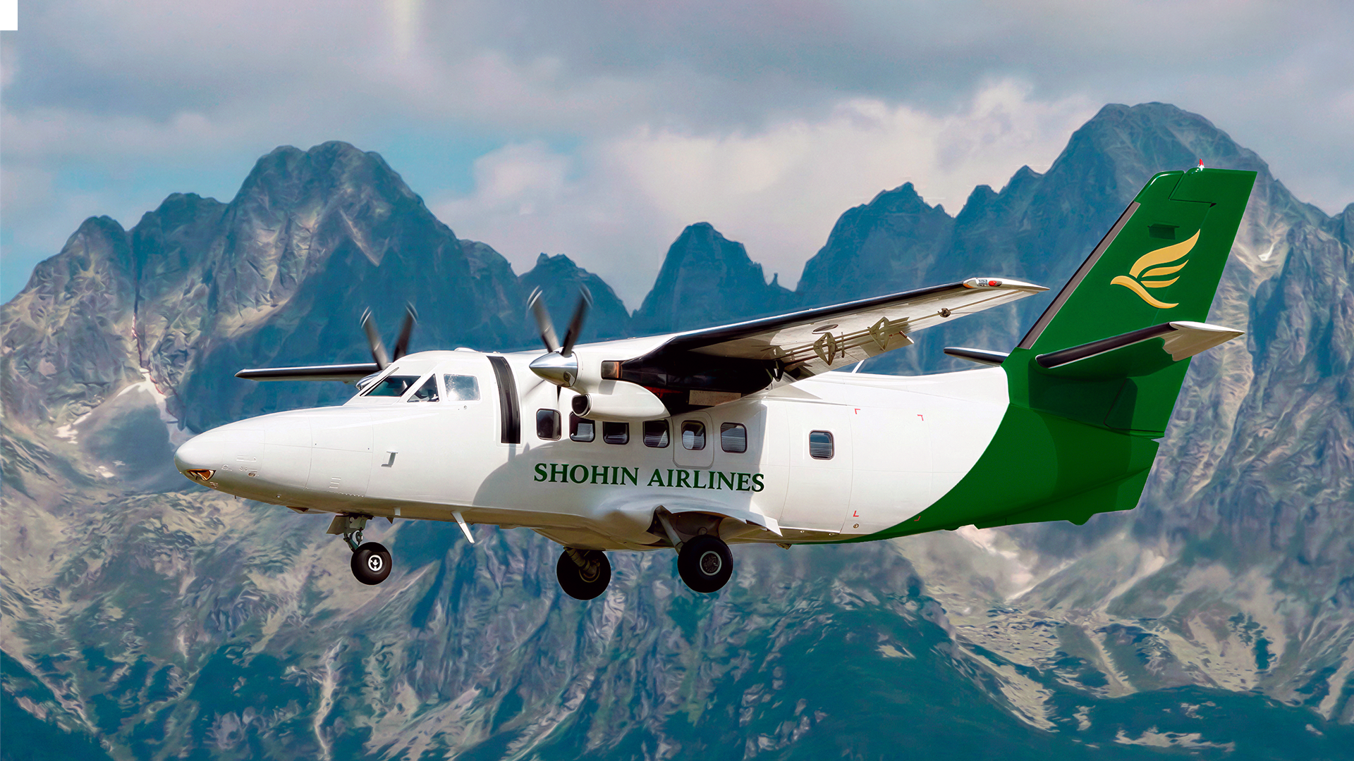
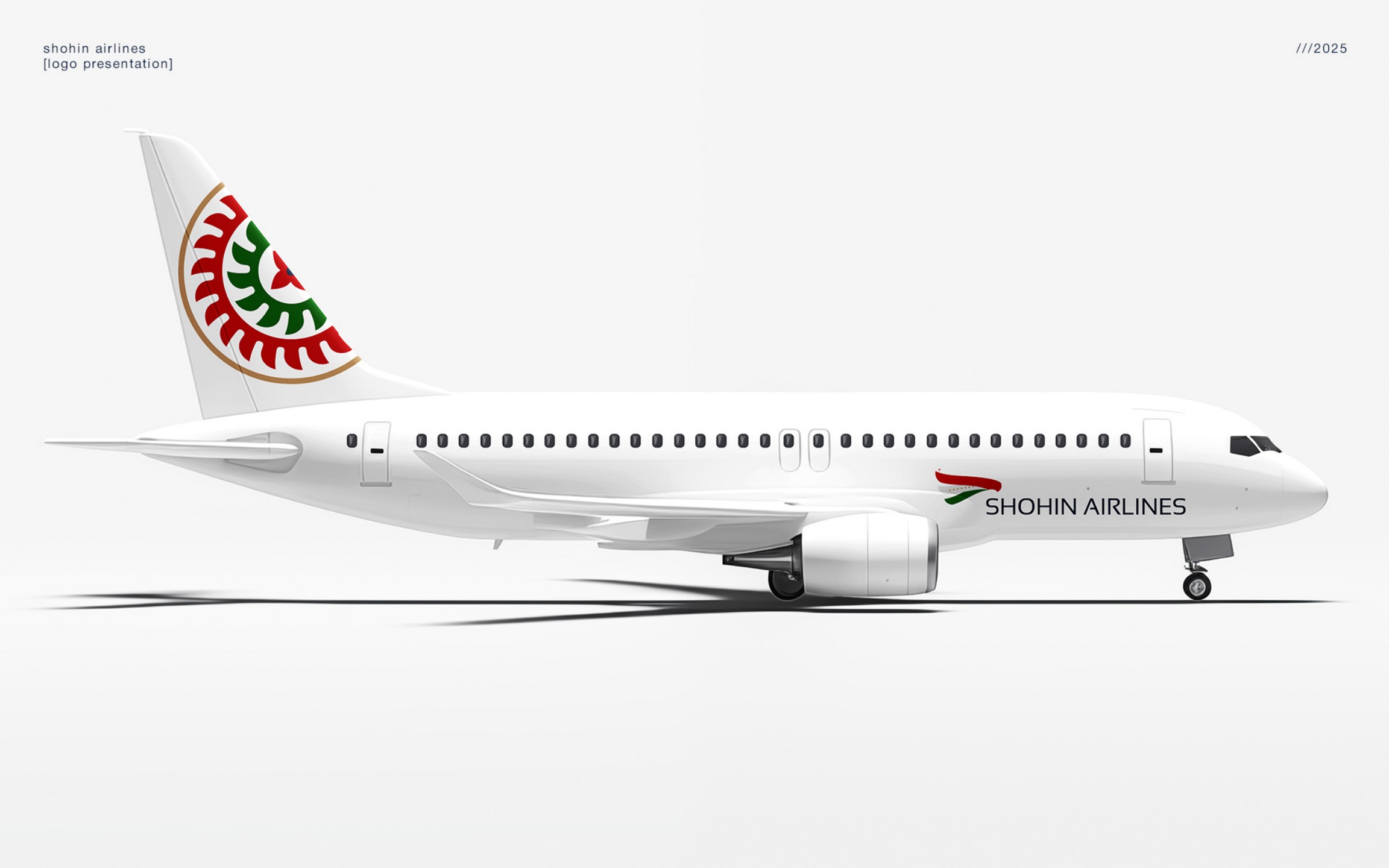
The strongest expression of our recommended direction was the blue-and-gold aircraft livery. The ornamental tail translated Tajik visual heritage into a distinctive aviation asset, while the restrained fuselage treatment preserved the clarity and confidence expected from an international airline. This is how KILEV LAB envisioned Shohin Airlines as a complete brand in the sky.
The Final Mark Came from the Client
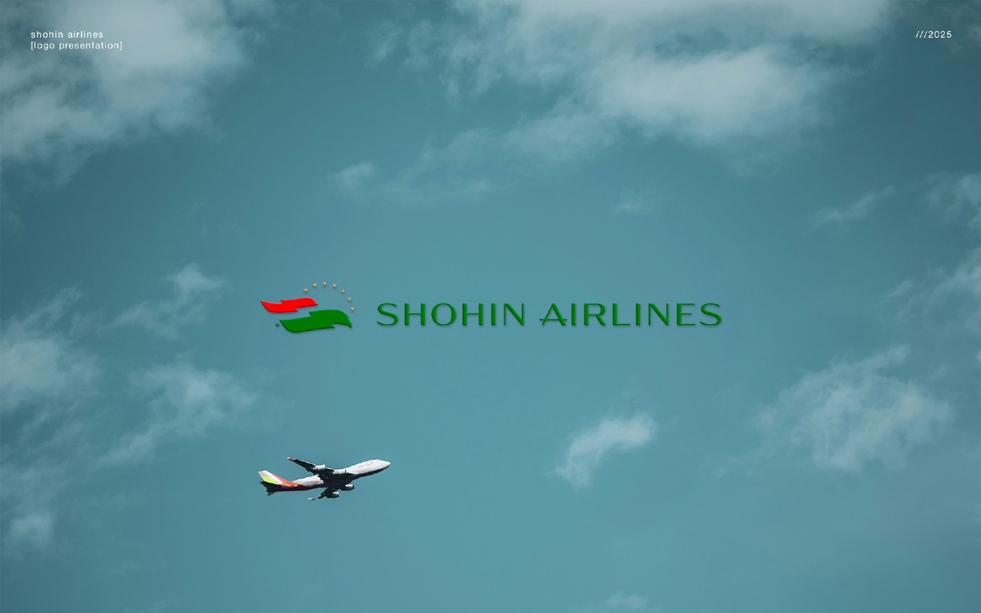
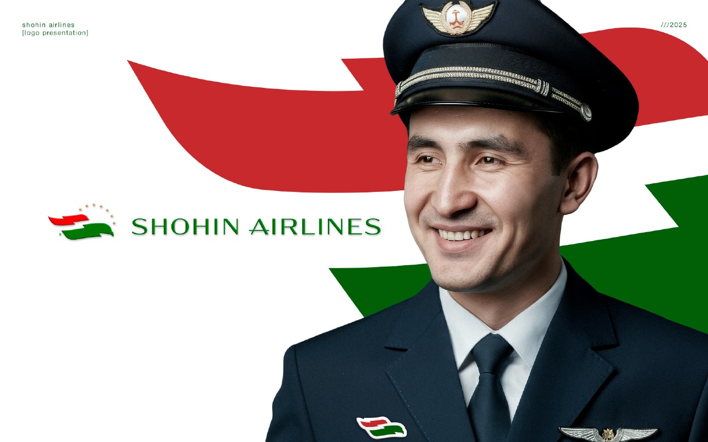
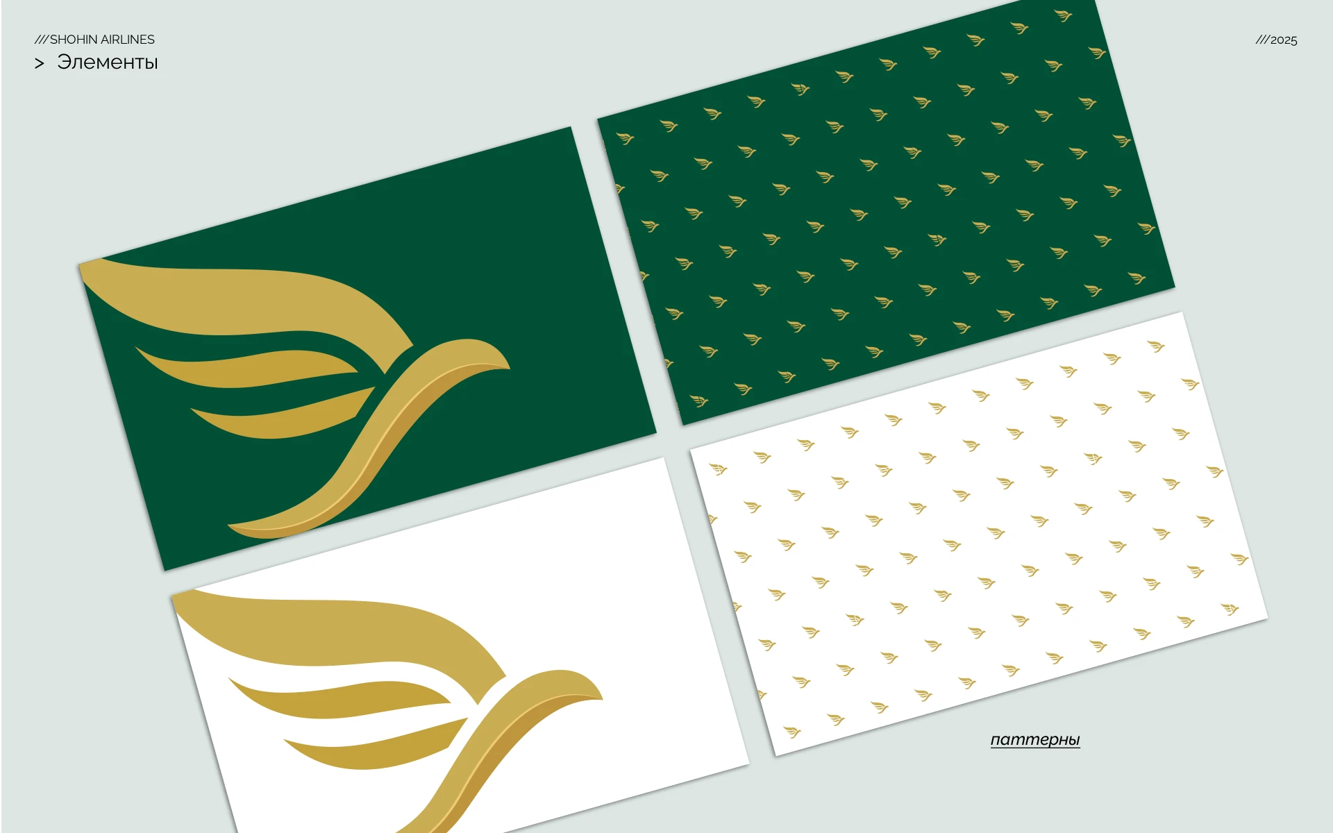
After the three creative rounds, the client supplied a different logo direction of its own, described to us as having been generated with the assistance of artificial intelligence. This was not one of the nine logo concepts created by KILEV LAB.
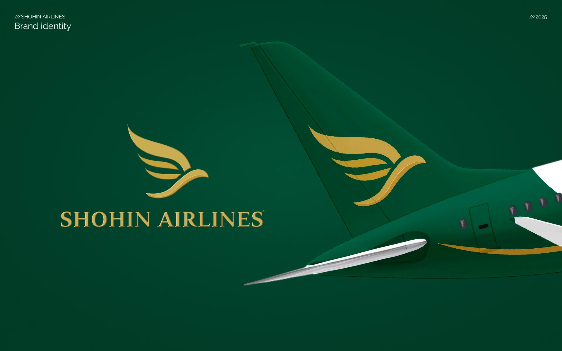
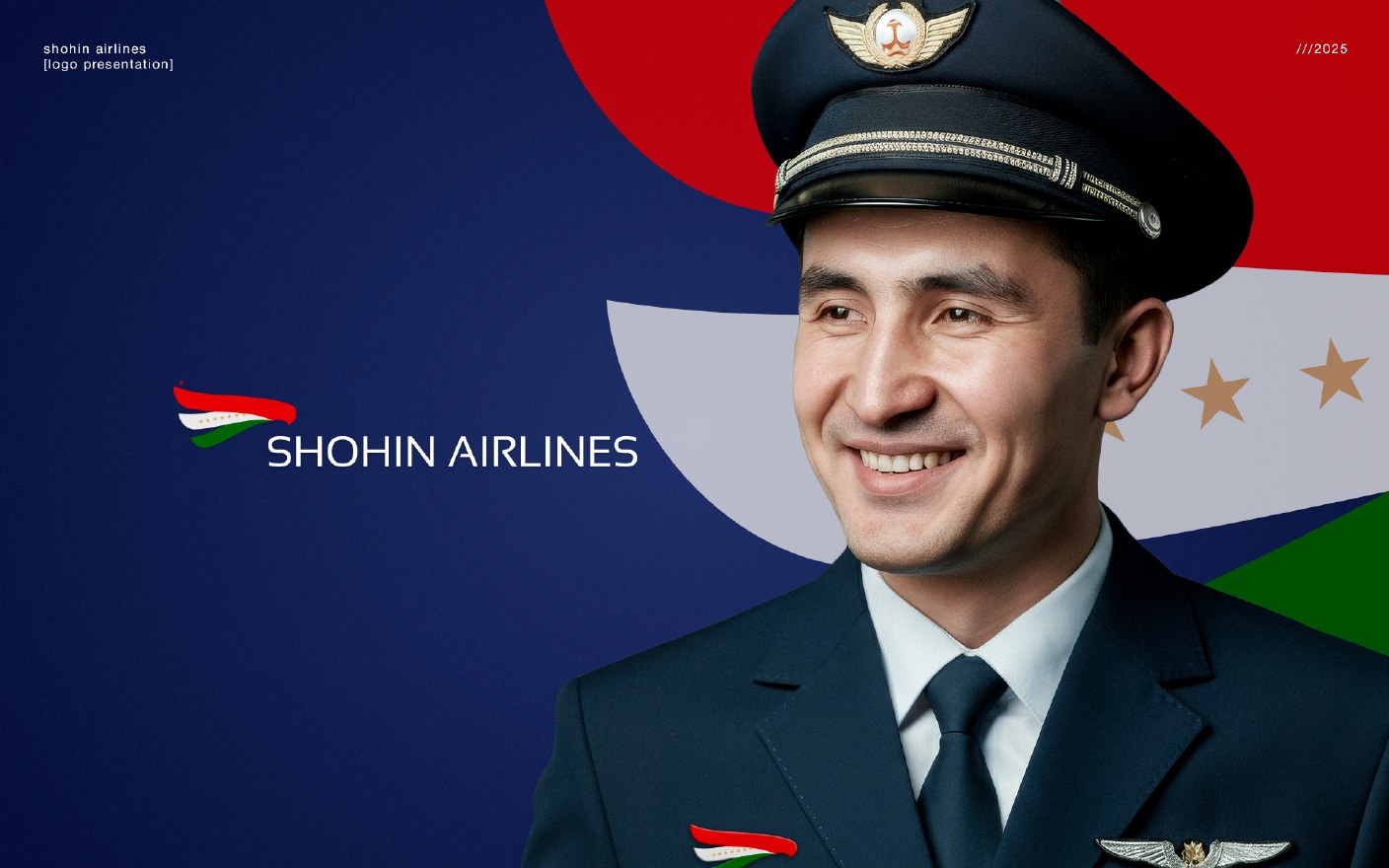
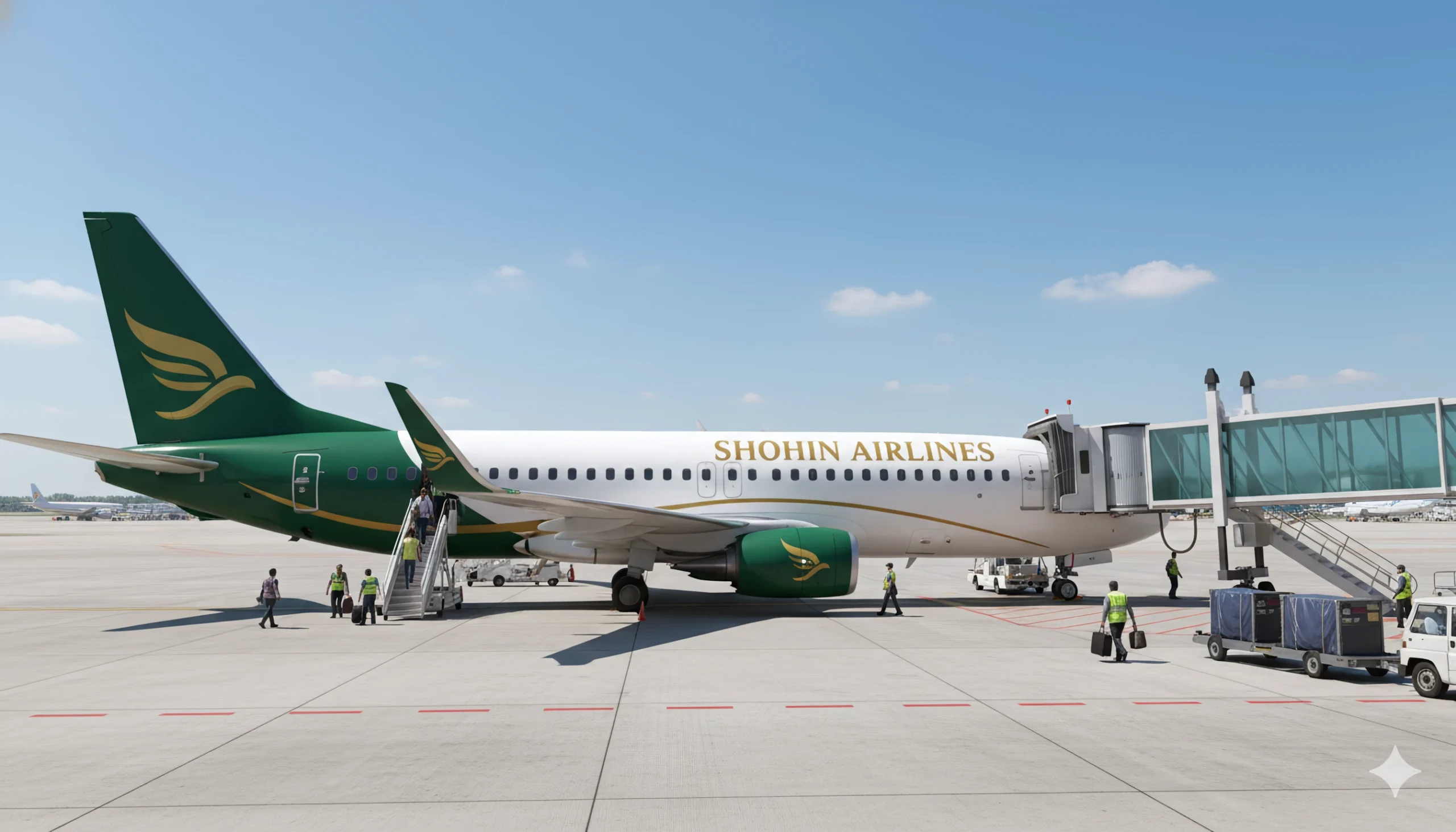
As the appointed design partner, we accepted the client’s final choice. Our role then shifted from logo creation to something equally important: turning the supplied symbol into a coherent, functional and scalable identity system for an airline.
Why Client-Directed AI Branding So Often Looks Generic
This project reflects a wider contradiction in contemporary branding. Companies often hire an experienced branding agency because they want a meaningful, distinctive and commercially credible brand. At the same time, some try to reduce costs or accelerate decision-making by directing the design themselves and bringing raw AI-generated logo options into the process.
The problem is not the use of artificial intelligence itself. AI can be valuable for research, exploration and rapid prototyping when it is guided by a clear brand strategy and experienced creative judgement. The problem begins when an AI-generated image is treated as a finished identity before positioning, cultural context, competitive differentiation and practical brand applications have been resolved.
Generative tools are exceptionally good at recognising and recombining familiar visual patterns. That same strength can also produce predictable results: another wing, another abstract bird, another polished gradient or emblem that feels plausible at first glance but could belong to almost any company. Instead of becoming an ownable business asset, the brand becomes an AI-produced template — visually competent, yet strategically interchangeable.
This risk becomes especially serious in airline branding, where identity must communicate trust, national character, safety and ambition across aircraft, airports, uniforms, tickets and digital interfaces. A logo cannot be evaluated only as an isolated picture. It must carry a specific story and remain recognisable in a category already crowded with wings, birds, flags and circular symbols.
Strong branding requires a different balance of responsibilities. The client brings business knowledge, ambition and final decision-making authority. The branding agency brings research, strategy, authorship and the ability to translate those inputs into a coherent visual system. When creative direction is reduced to prompt-generated references and subjective micro-management, both sides may spend more time while the final brand becomes less distinctive.
Our position is therefore not anti-AI. KILEV LAB actively works with AI where it strengthens analysis, production and customer experience. But AI should support human creativity rather than replace it. A valuable brand is not simply generated; it is interpreted, argued for, refined and deliberately made different.
Building the Identity Beyond the Logo
Aviation branding cannot stop at a logo. The identity must work at radically different scales and in demanding environments: on an aircraft fuselage, at an airport counter, inside a cabin, on a boarding pass and on a mobile screen.
Using the client-selected mark as the fixed starting point, KILEV LAB developed the broader Shohin Airlines visual system. The work included the green-and-gold colour palette, typography, layout principles, livery applications and a wide range of passenger-facing and operational touchpoints.
- Passenger aircraft and helicopter livery
- Airport and check-in applications
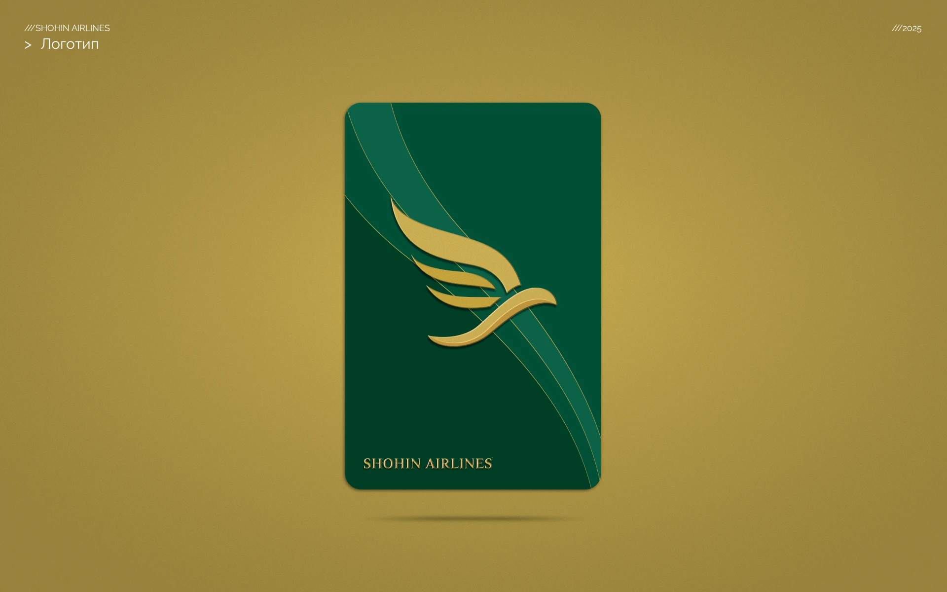
- Boarding passes, tickets and luggage tags
- Crew uniforms and in-flight materials
- Advertising, digital media and website applications
- A structured brand book covering approximately 50 branded items
Authorship Matters
This case illustrates an important distinction in branding practice. A logo and a brand identity are related, but they are not the same deliverable. The final logo direction was selected and supplied by the client. The identity system, applications, production logic and brand guidelines were developed by KILEV LAB around that choice.
We are publishing this process note to document that distinction clearly and professionally. Creative work is often shaped by several rounds of exploration, client decisions and practical constraints. Transparency about those stages helps clients and designers understand where strategic authorship begins and where execution continues.
The Result
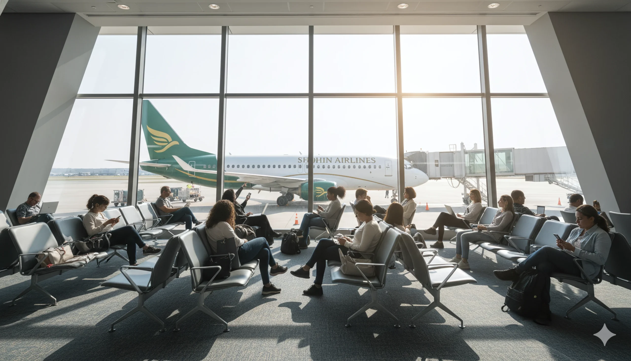
The resulting system gives Shohin Airlines a consistent visual presence across aircraft, airport, cabin, print and digital environments. It demonstrates how a design team can build structure and usability around a fixed client-selected asset, even when that asset differs from the agency’s original creative recommendations.
View the complete visual presentation on Behance, or explore more KILEV LAB branding projects.

Share


