


4 min read
Updated on 07 Apr 2026
n real estate, square meters are no longer the product. What buyers actually choose is a way of living — a lifestyle, a feeling, a promise.
And that promise is built through brand identity.
Today, residential projects compete not only through location or architecture, but through how clearly they answer one question:
“Who is this for — and what will life feel like here?”
If that answer is vague, the project becomes interchangeable.
If it is clear and emotionally compelling, it becomes desirable.
Start with the Core: Who Is This For?
Every strong residential brand begins not with a logo, but with a deep understanding of its audience.
Not abstract segments, but real motivations:
- A family looking for safety, calm, and space for children
- A remote professional seeking aesthetics and flexibility
- An investor focused on yield, liquidity, and demand
Each of these audiences requires a completely different language.
A family does not buy square meters — they buy peace of mind.
An investor does not buy design — they buy predictable return.
That means the entire identity system must adapt:
- visuals
- messaging
- tone
- composition
Everything.

Identity Is Not Decoration — It Is a Promise
Colors and typography are tools. Important — but secondary.
The real role of identity is to encode a promise.
Every residential brand communicates one core idea:
“If you choose this place, your life will look like this.”
And that vision must be:
- visible
- emotionally clear
- instantly recognizable
This is where many developments fail.
They create something visually appealing — but not meaningful.
Key Visuals: The Most Powerful Layer of Identity
The center of modern real estate branding is not the logo.
It is the key visual system.
Key visuals communicate what the future will feel like:
- how mornings begin
- how evenings unfold
- who lives here
- what kind of life happens inside the space
For example:
Family-oriented projects
- soft light, warm tones
- parents and children
- calm, safety, emotional comfort
Holiday home or resort properties
- movement, sunlight, openness
- emotional release
- the feeling of finally slowing down
Investor-focused developments
- clarity, structure, precision
- data-driven visuals
- confidence through evidence
Key visuals do not decorate the brand — they define its value.
Holiday Home Real Estate: Selling Emotion First
In projects designed for occasional living — such as Bali or Phuket — the logic changes.
This is not a primary residence.
It is a second life.
Which means:
- decisions are more emotional
- logic comes after the feeling
The brand must communicate:
- anticipation
- escape
- contrast with everyday life
You are not selling property.
You are selling a state of mind.
Case-Based Approach: How Identity Shapes Perception
At Kilev Lab, we approach identity as a system of meaning — not decoration.
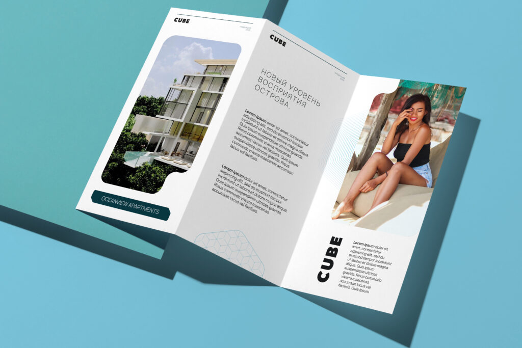
CUBE Apartments (Uluwatu, Bali)
A project built around modern architecture and a flexible lifestyle.
The identity emphasizes:
- minimalism
- geometry
- independence
- mobility
It speaks to a global audience that values freedom and movement over permanence.
Canopy Hills Villas (Phuket)
A hybrid positioning between lifestyle and investment.
The identity works on two levels:
- emotional: nature, elevation, exclusivity
- rational: scarcity, architecture, long-term value
This balance is essential when addressing mixed audiences.
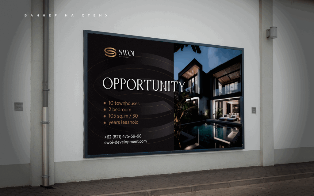
SWOI GROUP (Bali, Indonesia)
A development approach focused on holiday home real estate.
Each project is built around a specific lifestyle scenario.
The visual language changes — but the strategic logic remains consistent.
There is no universal style.
Only precise alignment with audience expectations.
Naming: Framing Perception Before the First Visual
A name is the first signal a brand sends.
It sets expectations before any visual interaction happens.
Strong naming in real estate:
- evokes a place or atmosphere
- reflects the audience
- supports the positioning
“Parkside Residences” suggests calm and greenery.
“Urban Nest” suggests density, comfort, and modern rhythm.
Different audiences — different meanings.
Consistency Matters — But Meaning Matters More
Brand consistency is often seen as the primary goal:
- same colors
- same typography
- same tone of voice
That is the baseline.
But consistency without meaning does not create value.
What truly matters is this:
Every element of the brand must reinforce the same promise.
When visuals, naming, messaging, and experience align —
the brand becomes believable.
Final Thought
In real estate, people do not buy properties.
They buy a version of their future.
A strong brand identity makes that future visible, tangible, and desirable — long before construction is complete.
If you are developing a residential project and want it to stand out not only visually but strategically, explore how we approach branding at Kilev Lab.
We design identities that do not just look good — they communicate, persuade, and sell.

Share


